Appearance
Widgets
Widgets are the parts your finished instrument is made of: the knobs, sliders, buttons, labels, shapes and drop zones that you and your users actually click and turn. They are what sits on the front panel, the polished face of your creation, and they carry values into and out of your patch (the network of connected nodes) through their pins (the little dots where you plug cables in). Most widgets have an Appearance input that takes a small block of style settings written as JSON (a simple text format for describing settings), so you can change how a widget looks from inside the patch itself, usually by feeding it from an Appearance Changer node, without opening the inspector panel. This page describes every node in the Widgets category.
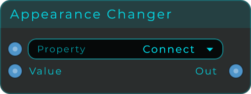
Appearance Changer
This node lets you restyle a connected widget on the fly from inside your patch. You pick one look-and-feel property (for example a colour or a size), feed in a new value, and it builds the small block of style settings that the widget understands. The Property list fills in by itself when everything it is connected to is the same kind of widget. If you have connected different widget types at once, it shows "Mixed targets" and stays empty.
| Parameter | Range | Default | Description |
|---|---|---|---|
| Property | (auto from targets) | Connect | Selected appearance property. Auto-populates from connected widget Appearance targets when they are all the same type, otherwise shows "Mixed targets". Also accepts a zero-based property index or a property id/label text. |
| Value | any | 0 | Incoming property value. Text, bool, and numeric values are converted to the selected property's JSON type. |
Inputs: Property (selects the target property by index or by id/label text), Value (the value assigned to the selected property). Outputs: Out (a JSON text patch holding one property, ready to connect to a widget's Appearance input).
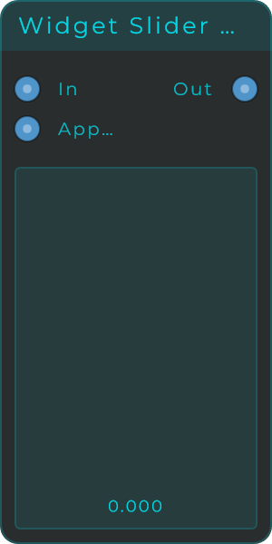
Widget Slider Vertical
An up-and-down slider for your front panel. As you drag it, it sends out a smoothly changing number somewhere between your chosen lowest and highest values (Min and Max). You can fully style its look: the track, the coloured fill, the border, how rounded the corners are, the value text and where the label sits.
| Parameter | Range | Default | Description |
|---|---|---|---|
| Value | 0 to 1 | 0 | Current slider value. |
| Min | unbounded | 0 | Lower bound for the slider value range. |
| Max | unbounded | 1 | Upper bound for the slider value range. |
| Default | unbounded | 0 | Default value used for reset behaviour. |
| Increment | unbounded | 0 | Optional snap step. Set to 0 for continuous movement. |
| Drag Sensitivity | 0.1 to 20 | 1 | Scales how quickly the slider responds to dragging. |
| Track Colour, Fill Colour, Border Colour, Text Colour | colour | theme | Colours of the track, active fill, border and value text. |
| Corner Radius | 0 to 100 | 3 | Corner radius of the slider body. |
| Border Width | 0 to 100 | 1 | Width of the slider border. |
| Show Value | on / off | on | Shows or hides the formatted value text. |
| Text Size | 8 to 48 | 11 | Font size of the value text. |
| Text Position | (choice) | Inside Top | Places the value text inside or outside the slider. |
| Display Mode | Float / Integer / Note | Float | Formats the displayed value. |
| Suffix | text | (empty) | Text appended after the displayed value. |
Inputs: In (sets the value), Appearance (JSON object to restyle the widget). Outputs: Out (the current value as a float).
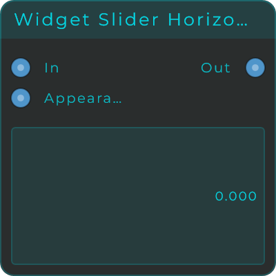
Widget Slider Horizontal
A left-to-right slider for your front panel. It works just like the up-and-down slider, sending out a smoothly changing number between your lowest and highest values (Min and Max) with the same full styling options, but it is laid out sideways.
| Parameter | Range | Default | Description |
|---|---|---|---|
| Value | 0 to 1 | 0 | Current slider value. |
| Min | unbounded | 0 | Lower bound for the slider value range. |
| Max | unbounded | 1 | Upper bound for the slider value range. |
| Default | unbounded | 0 | Default value used for reset behaviour. |
| Increment | unbounded | 0 | Optional snap step. Set to 0 for continuous movement. |
| Drag Sensitivity | 0.1 to 20 | 1 | Scales how quickly the slider responds to dragging. |
| Track Colour, Fill Colour, Border Colour, Text Colour | colour | theme | Colours of the track, active fill, border and value text. |
| Corner Radius | 0 to 100 | 3 | Corner radius of the slider body. |
| Border Width | 0 to 100 | 1 | Width of the slider border. |
| Show Value | on / off | on | Shows or hides the formatted value text. |
| Text Size | 8 to 48 | 11 | Font size of the value text. |
| Text Position | (choice) | Inside Left | Places the value text inside or outside the slider. |
| Display Mode | Float / Integer / Note | Float | Formats the displayed value. |
| Suffix | text | (empty) | Text appended after the displayed value. |
Inputs: In (sets the value), Appearance (JSON object to restyle the widget). Outputs: Out (the current value as a float).
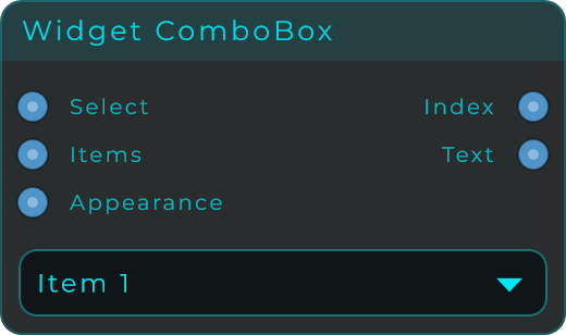
Widget ComboBox
A drop-down menu for your front panel: click it and a list of choices opens. You write the list of items yourself, and you can set how the text lines up and style the border and the little arrow. It sends out both the position of the chosen item in the list and its text. Ready-made item lists are included for common musical choices.
| Parameter | Range | Default | Description |
|---|---|---|---|
| Items Preset | Custom / Notes / MIDI Scales / Chord Types / Cycle / Waveforms | Custom | Loads a predefined item list, or Custom to use your own. |
| Items | text | Item 1, Item 2, Item 3 | The list of items. Separate entries with commas or line breaks. |
| Selected Index | 0 to item count | 0 | Index of the currently selected item. |
| Text Size (%) | 10 to 90 | 40 | Text size as a percentage of the combo height. |
| Text Align | Left / Centre / Right | Left | Horizontal text alignment. |
| Text Font | Regular / Medium / SemiBold / Bold / Light | Regular | Font weight of the combo text. |
| Popup Text Size (%) | 10 to 90 | 40 | Popup text size as a percentage of the combo height. |
| Popup Item Height | 0 to 80 | 35 | Height of each popup item. Use 0 for auto sizing. |
| Background / Text / Border / Arrow Colour | colour | theme | Colours of the body, text, border and drop-down arrow. |
| Border Width | 0 to 12 | 1 | Width of the combo border. |
| Corner Radius | 0 to 40 | 8 | Corner radius of the combo body. |
| Arrow Scale | 20 to 300 | 100 | Scale of the drop-down arrow. |
| Tooltip | text | (empty) | Tooltip shown when hovering the widget. |
Inputs: Select (selects an item by index or by item text), Items (replaces the item list), Appearance (JSON object to change appearance and items). Outputs: Index (the selected item index), Text (the selected item text).
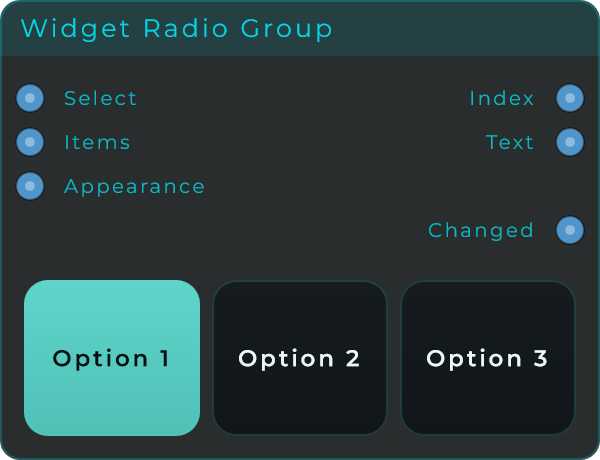
Widget Radio Group
A row or column of clickable buttons that act as one group. The Selection Mode decides how clicking behaves: Single (only one can be on at a time, like old car-radio buttons), Multi (turn on any combination, or none at all) or Multi (min 1) (any combination, but at least one always stays on). It sends out the position of the button you clicked most recently and its label.
| Parameter | Range | Default | Description |
|---|---|---|---|
| Selection Mode | Single / Multi / Multi (min 1) | Single | How clicks behave: radio, free multi-select, or multi-select with at least one on. |
| Items | text | Option 1, Option 2, Option 3 | The list of segment labels. Separate entries with commas or line breaks. |
| Selected Index | 0 to item count | 0 | Index of the active (or most-recently-clicked) segment. |
| Orientation | Horizontal / Vertical | Horizontal | Layout direction of the segments. |
| Gap | 0 to 30 | 6 | Gap between segments. |
| Text Size | 8 to 42 | 14 | Segment text size. |
| Corner Radius | 0 to 100 | 12 | Corner radius of each segment. |
| Face / Active / Hover Colour | colour | (preset) | Background of unselected segments, the selected segment, and the hover tint. |
| Text / Active Text / Border Colour | colour | (preset) | Text colour of unselected and selected segments, and the segment outline. |
| Tooltip | text | (empty) | Tooltip shown on hover. |
Inputs: Select (selects an item by index or by text), Items (replaces the item list), Appearance (JSON object to change appearance and items). Outputs: Index (the selected segment index; the most-recently-clicked one in Multi modes), Text (the selected segment text).
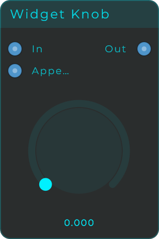
Widget Knob
A round knob for your front panel that you turn to send out a smoothly changing number between your chosen lowest and highest values (Min and Max). You can style almost everything about it: the shape of the arc it sweeps, the pointer style, a centre dot, the background, the outline, the tick marks and the value readout. It can grow from one end (unipolar) or from the middle outwards (bipolar), which is handy for things that go both ways, like pan or pitch.
| Parameter | Range | Default | Description |
|---|---|---|---|
| Value | 0 to 1 | 0 | Current knob value. |
| Min | unbounded | 0 | Lower bound for the knob value range. |
| Max | unbounded | 1 | Upper bound for the knob value range. |
| Default | unbounded | 0 | Default value used for reset and double-click. |
| Increment | unbounded | 0 | Optional snap step. Set to 0 for continuous movement. |
| Drag Direction | Vertical / Horizontal / Rotary | Vertical | Drag gesture used to turn the knob. |
| Start Angle | 0 to 360 deg | 225 | Start angle of the rotary arc. |
| Sweep Angle | 10 to 360 deg | 270 | Total arc span of the knob. |
| Bipolar | on / off | off | Draws the fill from the centre instead of from the start. |
| Thumb Style | None / Dot / Line | Dot | Selects no thumb, a dot, or a radial line indicator. |
| Show Centre Dot | on / off | off | Draws a dot in the middle of the knob. |
| Show Background | on / off | on | Draws a circular background behind the knob. |
| Show Outline | on / off | off | Draws an outline around the background. |
| Show Ticks | on / off | off | Draws tick marks along the arc. |
| Tick Count | 2 to 200 | 11 | Number of tick marks. |
| Show Value | on / off | on | Shows or hides the value text. |
| Text Size | 8 to 48 | 11 | Font size of the value text. |
| Display Mode | Float / Integer / Note | Float | Formats the displayed value. |
Inputs: In (sets the knob value, clamped to range and snapped to the increment), Appearance (JSON object to restyle the widget). Outputs: Out (the current knob value as a float).
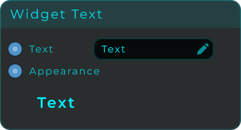
Widget Text
A text label for your front panel. Use it to show fixed words, or to display a live value coming from anywhere in your patch. You can choose the font, the weight, how the text lines up, the colour, the spacing around it, a border, and the direction it reads (including sideways and stacked top-to-bottom).
| Parameter | Range | Default | Description |
|---|---|---|---|
| Text Size | 8 to 120 | 18 | Base font size in pixels. |
| Font Style | Regular / Medium / SemiBold / Bold / Light (+ italics) | SemiBold | Font weight and italic style for the label. |
| Underline | on / off | off | Draws the text underlined. |
| Justification | 9-way (Top Left to Bottom Right) | Centre | Text alignment inside the widget. |
| Orientation | Horizontal / Vertical (up) / Vertical (down) / Stacked | Horizontal | Text orientation. Stacked draws one letter per row, unrotated. |
| Padding | 0 to 80 | 10 | Inner padding around the text area. |
| Text Colour | colour | theme | Colour of the text. |
| Background Colour | colour | transparent | Background fill colour. |
| Border Colour | colour | theme | Border colour. |
| Border Width | 0 to 12 | 0 | Stroke width of the optional border. |
| Tooltip | text | (empty) | Tooltip shown when hovering the widget. |
Inputs: Text (updates the displayed text; non-text values are converted to a readable string), Appearance (JSON object to restyle the widget). Outputs: none.
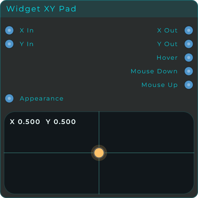
Widget XY Pad
A flat pad you drag around in two directions at once. Moving the handle sets an X value (left to right) and a Y value (up and down) at the same time, each with its own range, so you can control two things with one gesture. The node also tells the patch when the pointer is hovering over the pad and when the mouse is pressed or released.
| Parameter | Range | Default | Description |
|---|---|---|---|
| X | (Min X to Max X) | 0.5 | Current X value. |
| Y | (Min Y to Max Y) | 0.5 | Current Y value. |
| Min X / Max X | -1000 to 1000 | 0 / 1 | Bounds of the X range. |
| Min Y / Max Y | -1000 to 1000 | 0 / 1 | Bounds of the Y range. |
| Default X / Default Y | (within range) | 0.5 | Default X and Y values. |
| Increment X / Increment Y | 0 to 1000 | 0 | Optional snap step per axis. 0 is continuous. |
| Pad / Accent / Handle Colour | colour | (preset) | Pad surface, accent guides, and draggable handle. |
| Border / Crosshair / Text Colour | colour | (preset) | Border, X/Y guide lines, and readout text. |
| Show Text | on / off | on | Shows the current X/Y values. |
| Handle Size | 4 to 60 | 18 | Size of the draggable handle. |
| Corner Radius | 0 to 100 | 18 | Corner radius of the pad body. |
| Border Width | 0 to 100 | 1 | Border width of the pad body. |
| Tooltip | text | (empty) | Tooltip shown when the pad is hovered. |
Inputs: X In (sets X), Y In (sets Y), Appearance (JSON object to restyle the widget).
Outputs:
| Pin | Type | Description |
|---|---|---|
| X Out | Float | The current X value. |
| Y Out | Float | The current Y value. |
| Hover | Bool | High while the pointer is over the pad. |
| Mouse Down | Event | Fires when the pointer goes down on the pad. |
| Mouse Up | Event | Fires when the pointer is released. |
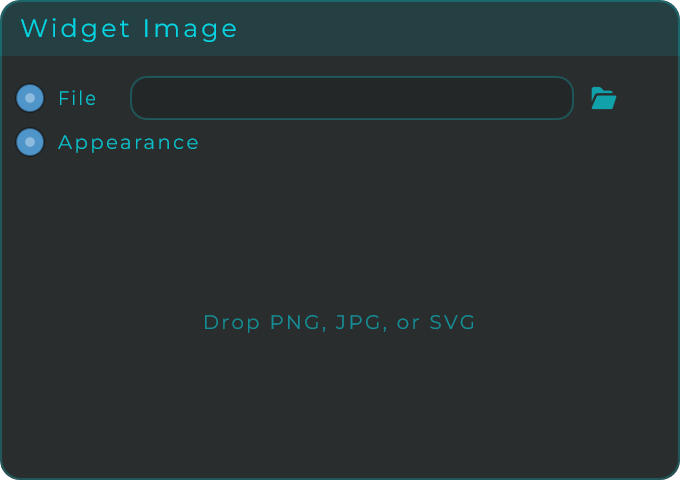
Widget Image
Shows a picture (PNG, JPG or SVG) both in your patch and on the front panel. You can drop a file straight onto it, choose how the picture fits the space or have it tile to fill, rotate it, make it more or less see-through, and frame it with a background and a border.
| Parameter | Range | Default | Description |
|---|---|---|---|
| File | png / jpg / jpeg / svg | (empty) | Path of the image to display. Drop a file or connect a text source. |
| Intercepts Clicks | on / off | on | When the panel is locked, the image either captures clicks or lets them pass through. |
| Fit Mode | Contain / Cover / Stretch / Original | Contain | How the image is fitted inside the widget. |
| Repeat | None / Repeat X / Repeat Y / Repeat Both | None | Tiles the image across the widget. |
| Scale % | 1 to 300 | 100 | Scales the image inside its area. |
| Alpha | 0 to 1 | 1 | Image opacity. |
| Rotation | 0 to 360 | 0 | Rotates the image in degrees. |
| Render Quality | Low / Medium / High | Medium | Image resampling quality. |
| Background Colour | colour | transparent | Background fill behind the image. |
| Border Colour | colour | (preset) | Border colour. |
| Border Width | 0 to 12 | 0 | Width of the border. |
| Corner Radius | 0 to 100 | 0 | Corner radius of the widget. |
Inputs: File (sets the image path), Appearance (JSON object to restyle the widget). Outputs: none.
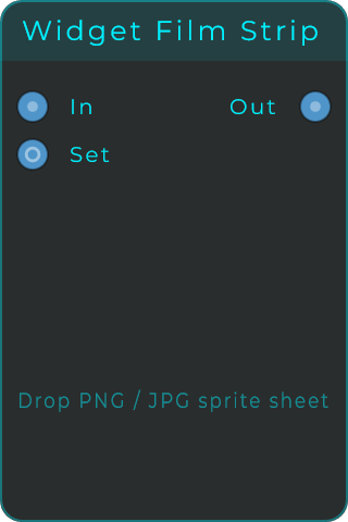
Widget Film Strip
Shows a single frame picked from one long picture made of many small frames stacked together (a sprite sheet). This is the classic way to build your own custom knob look from a set of ready-made frames: as the incoming value changes, the displayed frame changes, so the knob appears to turn. The frames can be stacked vertically or laid out horizontally, and the widget can behave as a slider, an on/off toggle, or a press-and-hold button.
| Parameter | Range | Default | Description |
|---|---|---|---|
| Value | 0 to 1 | 0 | Value that selects which frame is shown. |
| Min | unbounded | 0 | Lower bound of the value range. |
| Max | unbounded | 1 | Upper bound of the value range. |
| File | png / jpg / jpeg | (empty) | Path of the sprite-sheet image. |
| Orientation | Vertical / Horizontal | Vertical | How the frames are laid out in the strip. |
| Frame Count | 1 to 1024 | 128 | Number of frames in the strip. |
| Render Quality | Low / Medium / High | Medium | Image resampling quality. |
| Mode | Slider / Toggle / Button | Slider | Interaction style of the widget. |
| Drag Direction | Vertical / Horizontal | Vertical | Drag gesture used in Slider mode. |
Inputs: In (sets the value, clamped to range). Outputs: Out (the current value as a float).
Polygon Shadow
A soft drop shadow in the shape of a many-sided figure. It stores its blurred shape so it can redraw cheaply without slowing things down. Place it behind other widgets to give them a sense of depth. It has no fill or border of its own, just the shadow.
| Parameter | Range | Default | Description |
|---|---|---|---|
| Shadow Colour | colour | black 55% | Colour and alpha of the cached shadow. |
| Blur Radius | 0 to 64 | 18 | Blur radius in pixels. |
| Offset X | -120 to 120 | 0 | Horizontal shadow offset in pixels. |
| Offset Y | -120 to 120 | 0 | Vertical shadow offset in pixels. |
| Spread X | 0 to 100 | 75 | Shadow width as a percentage of the component. |
| Spread Y | 0 to 100 | 75 | Shadow height as a percentage of the component. |
| Reduce | 0 to 100 | 0 | Shrinks the rendered shape inward. |
| Corner Radius | 0 to 100 | 16 | Rounds the corners of the shadow shape. |
| Rotation | 0 to 360 | 45 | Rotates the shape in degrees. |
| Corners | 3 to 12 | 4 | Number of polygon corners. |
Inputs: Appearance (JSON object to restyle the widget). Outputs: none.
Square Shape
A simple square you can use to decorate your panel, with its own fill, border and rounded corners. Every part of its look, including a gradient fill or border (a smooth blend between two colours), can also be set from the Appearance style input.
| Parameter | Range | Default | Description |
|---|---|---|---|
| Fill Mode | Solid / Linear / Radial | Solid | Fill paint mode. |
| Fill Colour | colour | (preset) | Solid fill colour (or gradient endpoints in gradient modes). |
| Border Mode | Solid / Linear / Radial | Solid | Border paint mode. |
| Border Colour | colour | (preset) | Solid border colour. |
| Border Width | 0 to 40 | 2 | Stroke width in pixels. |
| Corner Radius | 0 to 100 | 16 | Rounded corner amount. |
| Reduce | 0 to 100 | 0 | Shrinks the rendered shape inward. |
| Rotation | 0 to 360 | 0 | Rotates the shape in degrees. |
Inputs: Appearance (JSON object to restyle the widget). Outputs: none.
Rectangle Shape
A simple rectangle for decorating your panel, with its own fill, border and rounded corners. Like the other shapes, you can completely change how it looks from the Appearance style input.
| Parameter | Range | Default | Description |
|---|---|---|---|
| Fill Mode | Solid / Linear / Radial | Solid | Fill paint mode. |
| Fill Colour | colour | (preset) | Solid fill colour (or gradient endpoints in gradient modes). |
| Border Mode | Solid / Linear / Radial | Solid | Border paint mode. |
| Border Colour | colour | (preset) | Solid border colour. |
| Border Width | 0 to 40 | 2 | Stroke width in pixels. |
| Corner Radius | 0 to 100 | 16 | Rounded corner amount. |
| Reduce | 0 to 100 | 0 | Shrinks the rendered shape inward. |
| Rotation | 0 to 360 | 0 | Rotates the shape in degrees. |
Inputs: Appearance (JSON object to restyle the widget). Outputs: none.
Circle Shape
A simple circle for decorating your panel, with its own fill and border. You can set a solid colour or a gradient (a smooth blend between two colours), either in the inspector panel or by feeding the Appearance style input.
| Parameter | Range | Default | Description |
|---|---|---|---|
| Fill Mode | Solid / Linear / Radial | Solid | Fill paint mode. |
| Fill Colour | colour | (preset) | Solid fill colour (or gradient endpoints in gradient modes). |
| Border Mode | Solid / Linear / Radial | Solid | Border paint mode. |
| Border Colour | colour | (preset) | Solid border colour. |
| Border Width | 0 to 40 | 2 | Stroke width in pixels. |
| Reduce | 0 to 100 | 0 | Shrinks the rendered shape inward. |
| Rotation | 0 to 360 | 0 | Rotates the shape in degrees. |
Inputs: Appearance (JSON object to restyle the widget). Outputs: none.
Triangle Shape
A simple triangle for decorating your panel, with its own fill, border and rounded corners. You can completely restyle it from the Appearance style input.
| Parameter | Range | Default | Description |
|---|---|---|---|
| Fill Mode | Solid / Linear / Radial | Solid | Fill paint mode. |
| Fill Colour | colour | (preset) | Solid fill colour (or gradient endpoints in gradient modes). |
| Border Mode | Solid / Linear / Radial | Solid | Border paint mode. |
| Border Colour | colour | (preset) | Solid border colour. |
| Border Width | 0 to 40 | 2 | Stroke width in pixels. |
| Corner Radius | 0 to 100 | 16 | Rounded corner amount. |
| Reduce | 0 to 100 | 0 | Shrinks the rendered shape inward. |
| Rotation | 0 to 360 | 0 | Rotates the shape in degrees. |
Inputs: Appearance (JSON object to restyle the widget). Outputs: none.
Polygon Shape
A many-sided shape for decorating your panel, where you choose how many corners it has, plus its own fill, border and rounded corners. Set the number of corners to make anything from a triangle up to a twelve-sided figure.
| Parameter | Range | Default | Description |
|---|---|---|---|
| Fill Mode | Solid / Linear / Radial | Solid | Fill paint mode. |
| Fill Colour | colour | (preset) | Solid fill colour (or gradient endpoints in gradient modes). |
| Border Mode | Solid / Linear / Radial | Solid | Border paint mode. |
| Border Colour | colour | (preset) | Solid border colour. |
| Border Width | 0 to 40 | 2 | Stroke width in pixels. |
| Corner Radius | 0 to 100 | 16 | Rounded corner amount. |
| Corners | 3 to 12 | 6 | Number of polygon corners. |
| Reduce | 0 to 100 | 0 | Shrinks the rendered shape inward. |
| Rotation | 0 to 360 | 0 | Rotates the shape in degrees. |
Inputs: Appearance (JSON object to restyle the widget). Outputs: none.
Line Shape
A straight line for decorating your panel, with its own thickness, rotation and end points. Choose Horizontal, Vertical, or Custom (where you set both ends yourself), and for the Horizontal and Vertical options you can pull both ends in evenly with an inset.
| Parameter | Range | Default | Description |
|---|---|---|---|
| Border Mode | Solid / Linear / Radial | Solid | Stroke paint mode. |
| Border Colour | colour | (preset) | Stroke colour. |
| Border Width | 0 to 40 | 2 | Stroke width in pixels. |
| Orientation | Horizontal / Vertical / Custom | Horizontal | Line orientation. Custom uses the Start/End points. |
| Inset | 0 to 50 | 0 | Symmetric inset for Horizontal and Vertical orientations. 0 is edge to edge. |
| Start X / Start Y | 0 to 100 | 15 / 50 | Line start point as a percentage of width/height (Custom). |
| End X / End Y | 0 to 100 | 85 / 50 | Line end point as a percentage of width/height (Custom). |
| Reduce | 0 to 100 | 0 | Shrinks the rendered shape inward. |
| Rotation | 0 to 360 | 0 | Rotates the shape in degrees. |
Inputs: Appearance (JSON object to restyle the widget). Outputs: none.
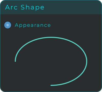
Arc Shape
A curved line (part of a circle) for decorating your panel, with its own thickness and adjustable start and length. Handy for rings, gauge-style markings and decorative curves.
| Parameter | Range | Default | Description |
|---|---|---|---|
| Border Mode | Solid / Linear / Radial | Solid | Stroke paint mode. |
| Border Colour | colour | (preset) | Stroke colour. |
| Stroke Width | 0 to 40 | 2 | Stroke width in pixels. |
| Start Angle | -360 to 360 | -90 | Arc start angle in degrees. |
| Sweep Angle | -360 to 360 | 270 | Arc sweep angle in degrees. |
| Reduce | 0 to 100 | 0 | Shrinks the rendered shape inward. |
| Rotation | 0 to 360 | 0 | Rotates the shape in degrees. |
Inputs: Appearance (JSON object to restyle the widget). Outputs: none.
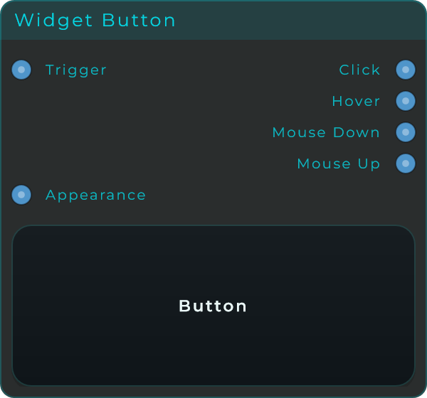
Widget Button
A press-and-hold button for your front panel. It stays on only while you hold it down and sends out a click signal, plus separate outputs for when the mouse goes down, when it comes back up, and when the pointer is hovering over it, so you can build richer reactions. You can give it a label, set different pictures for its up and pressed states, and fully restyle it.
| Parameter | Range | Default | Description |
|---|---|---|---|
| Label Off / Label On | text | Button / Pressed | Text shown while the button is up and while it is pressed. |
| Trigger On Mouse Down | on / off | off | Fires the click as soon as the mouse goes down instead of on release. |
| Show Text | on / off | on | Shows the text label over any button image. |
| Image Up / Image Down | svg / png / jpg | (empty) | Images used while the button is up and down. |
| Face / Active / Hover / Disabled Colour | colour | (preset) | Face colours for the idle, active, hover and disabled states. |
| Text / Border / Shadow Colour | colour | (preset) | Label, outline and shadow colours. |
| Text Size | 8 to 42 | 14 | Label font size. |
| Corner Radius | 0 to 100 | 14 | Corner radius of the button body. |
| Border Width | 0 to 100 | 1 | Outline thickness. |
| Tooltip | text | (empty) | Tooltip shown on hover. |
Inputs: Trigger (fires the button from the graph), Appearance (JSON object to restyle the widget).
Outputs:
| Pin | Type | Description |
|---|---|---|
| Hover | Bool | High while the pointer is over the button. |
| Mouse Down | Event | Fires when the pointer goes down. |
| Mouse Up | Event | Fires when the pointer is released. |
| Event | Event | Fires a click (on press or release, per Trigger On Mouse Down). |
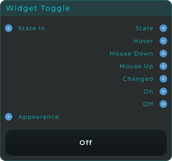
Widget Toggle
An on/off switch for your front panel. Click once to turn it on and it stays on; click again to turn it off. It sends out its current state, plus dedicated signals every time it flips: one for any change, one when it turns on, and one when it turns off. You can set different labels and pictures for the off and on states.
| Parameter | Range | Default | Description |
|---|---|---|---|
| State | on / off | off | Current toggle state. |
| Label Off / Label On | text | Off / On | Text shown while the toggle is off and on. |
| Trigger On Mouse Down | on / off | off | Flips the toggle on mouse down instead of on release. |
| Show Text | on / off | on | Shows the text label over any image. |
| Image Off / Image On | svg / png / jpg | (empty) | Images used while the toggle is off and on. |
| Face / Active / Hover / Disabled Colour | colour | (preset) | Face colours for the idle, active, hover and disabled states. |
| Text / Border / Shadow Colour | colour | (preset) | Label, outline and shadow colours. |
| Text Size | 8 to 42 | 14 | Label font size. |
| Corner Radius | 0 to 100 | 14 | Corner radius of the toggle body. |
| Border Width | 0 to 100 | 1 | Outline thickness. |
| Tooltip | text | (empty) | Tooltip shown on hover. |
Inputs: State In (sets the state from the graph), Appearance (JSON object to restyle the widget).
Outputs:
| Pin | Type | Description |
|---|---|---|
| State | Bool | The current toggle state. |
| Hover | Bool | High while the pointer is over the toggle. |
| Mouse Down | Event | Fires when the pointer goes down. |
| Mouse Up | Event | Fires when the pointer is released. |
| Changed | Event | Fires on every state flip. |
| On | Event | Fires when the toggle turns on. |
| Off | Event | Fires when the toggle turns off. |
MIDI Drag Exporter
Turns an incoming musical pattern or MIDI file into a real MIDI file you can drag straight onto the timeline in your music software (your DAW). Feed it either a MIDI File Descriptor or a raw pattern, then drag from the body of the widget into your DAW to drop a finished, ready-to-use .mid file. (MIDI is the standard way of describing notes and timing, separate from the actual sound.)
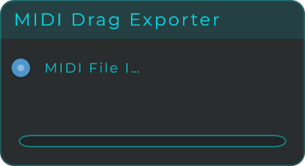
Inputs: MIDI File In (a MIDI File Descriptor JSON, for example from Pattern To MIDI File, or a raw Pattern JSON, for example from MIDI Riff Generator; patterns are auto-converted to a temporary .mid file). Outputs: none. The MIDI file leaves the node by dragging the widget body into your DAW.
Widget Sample Map
The visual editor for the Sampler, where you lay your sounds out across a keyboard. Drag and drop audio files (WAV, AIFF, FLAC, MP3 or OGG) onto the on-screen piano keys to create zones. Each zone assigns one sample to a range of keys and has its own pitch, volume, pan, fade, looping, ADSR (how the sound swells and fades over time) and velocity (how hard you play) settings. Connect MIDI In to feed it notes, and connect Sample View out to a Sampler so it can be heard.
Note: this node is registered with the title Sampler and type id
widget.sampler.
This node offers a large set of settings for each zone, and every one of them has its own input pin so you can change it live while the music plays. The most useful ones are:
| Parameter | Range | Default | Description |
|---|---|---|---|
| Select by MIDI | on / off | on | When on, incoming notes auto-select the matching zone. |
| Voices | 1 to 16 | (preset) | Maximum number of simultaneous voices. |
| Glide | on / off | off | Portamento between notes (mono only). |
| Glide Time (ms) | 1 to 5000 | (preset) | Glide time in milliseconds. |
| Bend Range | 0 to 48 | (preset) | Pitch-bend range in semitones. |
| Link (Edit All) | on / off | off | Applies parameter edits to all zones at once. |
| Root Note / Low Note / High Note | 0 to 127 | (per zone) | Original-pitch note and the zone's key range. |
| Low Vel / High Vel | 0 to 127 | (per zone) | Velocity range that triggers the zone. |
| Transpose / Fine Tune | semitones / cents | (per zone) | Pitch offset of the zone. |
| Volume / Pan | 0 to 1 / -1 to 1 | (per zone) | Output level and stereo position. |
| Attack / Decay / Sustain / Release | seconds / level | (per zone) | ADSR envelope of the zone. |
| Loop / Loop Start / Loop End / Loop Crossfade | on-off / normalised / ms | (per zone) | Sample loop settings. |
| Sample Start / Sample End | 0 to 1 | (per zone) | Playback start and end inside the file. |
Inputs: MIDI In (notes trigger the keyboard and pass through), Appearance (JSON appearance patch), plus a Data input pin per zone parameter listed above (Root Note, Low Note, High Note, Low Vel, High Vel, Transpose, Fine Tune, Volume, Pan, Attack, Decay, Sustain, Release, Fade In, Fade Out, Sample Start, Sample End, Loop Start, Loop End, Loop Xfade, Reverse, Fixed Vel, Loop On, Link, Select MIDI, Voices, Glide, Glide Time, Bend Range).
Outputs:
| Pin | Type | Description |
|---|---|---|
| MIDI Out | MIDI | External MIDI plus keyboard-click events. |
| Sample View | Data (Text) | The node id, for connecting to a Sample View or a Sampler's Sample Map input. |
| Out L | Audio | Left audio output. |
| Out R | Audio | Right audio output. |
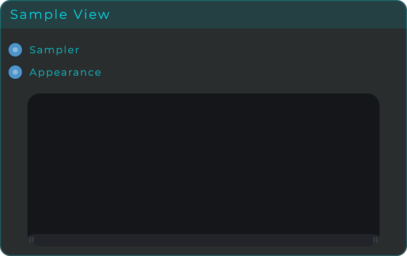
Widget Sample View
A window for viewing and editing the shape of a sound (its waveform) in the Sampler. Connect it to a Sample Map (or Sampler) and it draws the waveform of the selected zone, with markers you can drag to set the sample's start and end, its loop region and its fades. It also offers zoom, side-to-side scrolling, and a moving line that shows where playback currently is.
Note: this node is registered with the title Sample View and type id
widget.sampleView.
| Parameter | Range | Default | Description |
|---|---|---|---|
| Wave Colour | colour | theme | Colour of the waveform. |
| Wave Opacity | 0 to 1 | 0.75 | Opacity of the waveform fill. |
| Background Colour | colour | (preset) | Background fill behind the waveform. |
| Marker / Loop / Playhead / Fade Colour | colour | (preset) | Colours of the markers, loop region, playhead and fade curves. |
| Marker Width | 0.5 to 4 | 1.5 | Width of the marker lines. |
| Corner Radius | 0 to 100 | 0 | Corner radius of the widget body. |
| Show Info | on / off | on | Shows the info label. |
| Show Scrollbar | on / off | on | Shows the minimap scrollbar. |
| Show Fades | on / off | on | Draws the fade-in/out curves. |
| Show Playhead | on / off | on | Draws the real-time playhead. |
Inputs: Sampler (connect to a Sample Map or Sampler to display its zones), Appearance (JSON object to restyle the widget). Outputs: none.
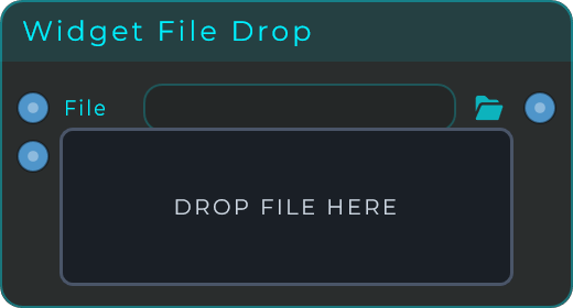
Widget File Drop
A drop zone that accepts any file you drag onto it, whether in your patch or on the front panel, and sends out the full location (path) of that file. You can limit which file types it accepts with the Accept Extensions setting, and style its background, border, corners and text. It is a handy building block for patches that need to react to dropped samples, presets or images.
| Parameter | Range | Default | Description |
|---|---|---|---|
| Label | text | DROP FILE HERE | Text shown on the drop zone when no file is loaded. |
| Accept Extensions | text | (any) | Semicolon-separated list of accepted extensions (e.g. "wav;aiff;flac"). Empty accepts any file. |
| Show Filename | on / off | on | Shows the filename on the widget after a file is dropped. |
| Background Colour | colour | (preset) | Background fill colour. |
| Border Colour | colour | (preset) | Border colour. |
| Border Width | 0 to 12 | 1.5 | Width of the border outline. |
| Corner Radius | 0 to 60 | 6 | Corner rounding radius in pixels. |
| Text Colour | colour | (preset) | Colour of the label and filename text. |
| Text Size | 8 to 48 | 12 | Font size of the label and filename. |
Inputs: File In (sets the file path programmatically), Appearance (JSON object to restyle the widget). Outputs: File Out (the absolute path of the dropped or loaded file).