Appearance
The Front Panel (Control Surface)
The Front Panel is a separate canvas where you build custom control surfaces using widgets. It's designed for live performance and hands-on interaction.
Overview
The Front Panel is independent from the Graph Panel. While the graph defines your audio signal flow, the Front Panel provides a user-friendly interface for controlling parameters.
Edit vs Perform Mode
| Mode | Purpose |
|---|---|
| Edit (Unlocked) | Add, move, resize, and configure widgets |
| Perform (Locked) | Interact with widgets only, no accidental edits |
Toggle between modes using the Lock/Unlock button in the Front Panel toolbar, or by pressing Ctrl + Click on an empty area of the Front Panel.
Navigating the Front Panel
Panning the canvas
Move the whole panel (frames and their content) around so you can bring any element to the centre and focus on it. There are two gestures, the same as the graph:
- Hold the middle mouse button and drag.
- Hold Space and left-drag.
Both work from anywhere, including over a widget (these gestures are reserved for panning, so they never grab the widget under the cursor), at any zoom, and even while the panel is locked (panning only moves the view, never your layout). The panel starts centred, and Zoom to Fit / 100% recentre it.
Nudging widgets
With one or more widgets selected, the arrow keys move them by exactly one panel pixel for pixel-perfect alignment. Hold Shift with an arrow key for a bigger 10-pixel step to cover ground quickly. Each press is a single undo step, and locked widgets never move, even when they are part of the selection. The panel takes keyboard focus as soon as you click a widget or the canvas, so you can select and then nudge right away. Nudging is disabled in Perform mode and while the whole panel is locked.
 Needs:
 panel-pan-nudge.png, the Front Panel with widgets selected, showing the canvas panned (room around the panel) and arrow-key nudging of a selected widget.
Front Panel Toolbar
A floating toolbar at the bottom of the Front Panel. Like the graph toolbar, you can drag it to reposition and collapse/expand it.

| # | Button | Description |
|---|---|---|
| 1 | Drag handle (dots) | Drag to reposition the toolbar |
| 2 | Expand / Collapse | Show or hide the toolbar buttons |
| 3 | Layers | Show or hide the Layers palette. Lights up while the palette is visible |
| 4 | Lock / Unlock | Switch between Edit and Perform mode. When locked, widgets can only be interacted with (no moving or resizing) |
| 5 | Grid & Snap | Toggle the grid overlay. When enabled, widgets snap to the grid for easy alignment |
| 6 | Grid Size (slider + number) | Adjust grid spacing (5 to 80 pixels) |
| 7 | Zoom 100% (magnifying glass) | Reset zoom to 100% |
| 8 | Fit to View (expand arrows) | Auto-fit all widgets into the viewport |
| 9 | Zoom Level (slider + %) | Adjust zoom (15% to 500%) |
| 10 | Panel Dimensions (e.g., 800x600) | Shows the current panel size in pixels |
| 11 | Panel Size (dropdown arrow) | Choose from preset panel resolutions |
| 12 | Background Color (circle swatch) | Click to change the panel background color |
Both toolbars (Graph and Panel) can be collapsed to save space by clicking the expand/collapse button, and repositioned by dragging the grip handle.
Available Widgets
| Widget | Description |
|---|---|
| Slider (V/H) | Vertical or horizontal slider for continuous values |
| Knob | Rotary control for parameters |
| Button | Trigger an event |
| Toggle | On/off switch |
| ComboBox | Dropdown selection |
| RadioGroup | Mutually exclusive choice buttons |
| XY Pad | Two-dimensional control (e.g., filter freq + resonance) |
| Text | Display or edit text values |
| Image | Display an image file |
| Shapes | Square, Rectangle, Circle, Triangle, Hexagon, Arc, Line, Polygon |
| Keyboard (Keymap) | Piano keyboard for playing notes |
| Sample View | Waveform display |
| Sampler | Sample playback instrument |
| MIDI Drag Exporter | Drag MIDI clips out of MNodes |
See the full Widget reference for details on each widget type.
Adding Widgets to the Front Panel
There are two ways to add a widget to the Front Panel:
- Right-click on a widget node in the graph and select Add to Panel
- Select the widget node, open the Inspector → Panel section, and add it from there
Once added, switch to Edit mode (unlock) in the Front Panel toolbar to position and resize widgets.
Node Bodies in the Front Panel
Many nodes beyond dedicated widgets also have visual bodies that can be added to the Front Panel. For example, Dynamics nodes (Compressor, Limiter) show gain reduction meters, Analysis nodes (Spectrum, Oscilloscope) show real-time displays, and Meters show level indicators. These visual bodies can be added to the Front Panel just like widgets, giving you real-time visual feedback during performance. Their appearance can be customized using the Appearance Changer.
TIP
Don't limit yourself to nodes with "Widget" in the name. Any node that has a visual body can be added and customized in the Front Panel.
Widget Parameters
Each widget has configurable properties in the Inspector:
- Min / Max / Default values
- Step size for discrete steps
- Prefix / Suffix labels (e.g., "Hz", "dB", "%")
- Color customization
- Expose to DAW toggle for automation
Connecting Widgets
Widgets have output pins in the graph that you connect to other nodes:
- A Knob outputs its current value as Data
- A Button outputs an event
- A Keyboard outputs MIDI notes
- An XY Pad outputs two values (X and Y)
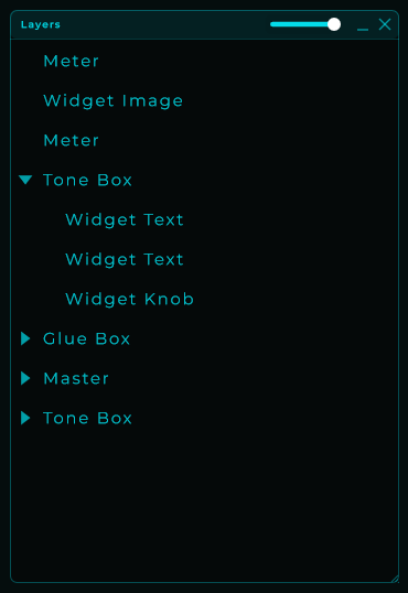
Layers Palette
A floating "Layers" panel that lists every widget on the Front Panel as a hierarchical tree, similar to the Layers panel in Figma or design tools. It is available in Edit mode for both the rack Front Panel and the module Front Panel, and stays out of the way in Perform mode.
Showing & hiding
Open and close the palette from View → Layers Palette in the menu bar. The check mark next to the entry shows whether it's currently visible.
The palette also has its own header buttons:
_minimizes it to just the header (keeps the position so you can re-expand quickly).Xcloses it. Reopen from the View menu when you need it again.
Position, size, visibility and minimized state are remembered between sessions.
Reading the tree
Each row represents a widget that lives on the current Front Panel. Items higher in the list are drawn on top of items below. Children appear indented under their parent and render on top of the parent (Figma-style layer order).
The header has a small slider that controls the height of the rows. The font size scales with it, so you can pack more widgets into a small palette or make the names easier to read on a big display. The scrollbar uses your theme color.
Selecting
The selection is shared between the canvas and the palette tree:
- Click a row to select that widget on the canvas.
- Click a widget on the canvas to highlight it in the tree.
- Ctrl (or ⌘) + click toggles a single item.
- Shift + click selects a range, in the same top-to-bottom order shown in the tree.
- Selecting a parent visually highlights its children too: moving the parent moves them as a group.
The selection also stays in sync with the Graph view: selecting a widget in the Layers palette will also select its node in the graph and vice versa.
Reordering and grouping (drag-drop)
Drag a row in the palette to:
- Reorder between siblings: drop on the gap between two rows.
- Reparent: drop directly on top of another item to make it a child.
- Move to root: drop on the empty area at the bottom of the tree.
Multi-selection is supported: select several rows and drag them as a block. The order between them is preserved at the destination. If you select a parent and one of its children, only the parent is moved explicitly: the child travels with it via the cascade so the hierarchy stays intact.
A single Undo (Ctrl/⌘ + Z) reverts a whole drag-drop transaction.
Cascades from the parent
When a widget has children, operations on the parent cascade to the entire subtree:
- Move: dragging the parent on the canvas drags every child by the same offset.
- Resize: scaling the parent scales each descendant proportionally (Figma "scale tool"-style).
- Duplicate / Delete: clones or removes the whole subtree.
- Z order: bringing the parent to front raises the entire subtree.
Children that are locked individually still follow the parent in cascades unless the parent itself is locked too.
Lock with inheritance
Lock a widget to protect it from being moved, resized, reparented, duplicated or deleted. Locking propagates to descendants: if you lock a parent, the whole subtree behaves as locked even if the children don't have their own lock flag set.
A small lock icon appears at the right edge of locked rows. On unlocked rows, the icon shows tinted only on hover so the tree stays clean. Click the icon to toggle the lock for that row, or use the Lock entry in the right-click menu for the current selection.
Rename
Rename a widget by double-clicking its row, or via right-click → Rename, or by pressing F2. The change writes back to the underlying node title, so it shows up everywhere the title is displayed (graph node, inspector, etc.). Press Enter to confirm or Esc to cancel.
Right-click menu
| Action | What it does |
|---|---|
| Rename | Inline edit the node title (also F2). |
| Locate in Panel | Briefly flashes the widget on the canvas and scrolls it into view, so you can find it among many. |
| Duplicate | Clones the selection (and any children) with a slight offset (also Ctrl/⌘ + D). |
| Delete | Removes the selection. Cascades to children but respects locked items (also Delete / Backspace). |
| Bring to Front | Move to the top of its sibling group. |
| Send to Back | Move to the bottom of its sibling group. |
| Lock / Unlock | Toggle the lock on the current selection (also Ctrl/⌘ + L). |
Front Panel State
Front Panel layout (widget positions, sizes, background color, view settings, parent/child hierarchy and lock flags) is saved as part of the preset file, separate from the graph state. The Layers palette's own position, size and visibility are kept per-app so they survive across DAW sessions.