Appearance
Widgets
Widgets are special nodes that create interactive UI controls in the Front Panel. They bridge the visual control surface with the audio graph.
Beyond Widget Nodes
Many nodes that don't have "Widget" in their name also have visual bodies that can be added and customized in the Front Panel. For example, Dynamics nodes (Compressor, Limiter), Analysis nodes (Spectrum, Oscilloscope), and Meters all have visual displays. See Node Bodies in the Front Panel for details.
Widget Types
Controls
| Widget | Outputs | Description |
|---|---|---|
| Slider (V) | Float (Data) | Vertical slider for continuous values |
| Slider (H) | Float (Data) | Horizontal slider for continuous values |
| Knob | Float (Data) | Rotary control |
| XY Pad | X + Y (Data) | Two-dimensional control surface |
| Button | Event (Data) | Momentary trigger. Fires an event when pressed |
| Toggle | Bool (Data) | On/off switch |
| ComboBox | Int (Data) | Dropdown selection |
| RadioGroup | Int (Data) | Mutually exclusive buttons |
| Keyboard (Keymap) | MIDI | Piano keyboard:outputs MIDI notes |
Display
| Widget | Inputs | Description |
|---|---|---|
| Text | String (Data) | Display or edit text |
| Image | File | Display an image file |
| Sample View | Audio | Waveform display |
| Sample Map | : | Multi-sample zone editor |
Shapes
| Widget | Description |
|---|---|
| Square | Square shape with fill color |
| Rectangle | Rectangle shape |
| Circle | Circle shape |
| Triangle | Triangle shape |
| Hexagon | Hexagon shape |
| Line | Line element |
| Arc | Arc/curve element |
| Polygon/Shadow | Custom polygon with shadow |
Special
| Widget | Description |
|---|---|
| MIDI Drag Exporter | Drag MIDI clips out of MNodes into your DAW |
| Appearance Changer | Dynamically change visual properties of other widgets |
Widget Properties
Every widget supports:
- Min / Max / Default:Value range
- Step size:Snap to discrete values
- Prefix / Suffix:Display units (e.g., "Hz", "%", "dB")
- Color:Customizable fill and accent colors
- Expose to DAW:Make automatable from your DAW
Position (Pos X / Pos Y)
The Inspector's Appearance section includes Pos X and Pos Y fields that hold the widget's position on the Front Panel, in pixels.

Needs: the Inspector Appearance section with the Pos X and Pos Y fields visible for a selected widget.
- Live both ways: dragging a widget or nudging it with the arrow keys updates the X/Y fields live, and editing the fields moves the widget on the panel.
- Whole pixels: X and Y step in whole pixels.
- Modulatable: Pos X and Pos Y also appear in an Appearance Changer and accept the node's Appearance input (e.g.
{"panelX": 120, "panelY": 40}), so a widget's position can be modulated or animated like any other appearance value. - Randomiser: X and Y are excluded from the appearance randomiser by default. Unlock them in the Inspector to include them.
Using Widgets in the Graph
Widgets appear as nodes in the graph with output pins. Connect them to any compatible input:
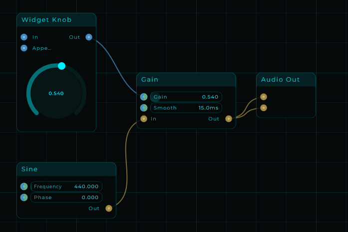
In this example, a Widget Knob controls the Gain parameter. The Knob's Data output is connected to the Gain's input, allowing real-time control from the Front Panel.
Linked Widgets
Widgets can be linked in a master/slave relationship: one widget controls another, useful for creating complex control surfaces.